
One UI's App Drawer: A Nod to Legacy in a Gesture-Driven Era
Samsung's One UI quietly removed the "all apps" button by default, yet offers a surprising olive branch to traditionalists. We unpack this subtle battleground…
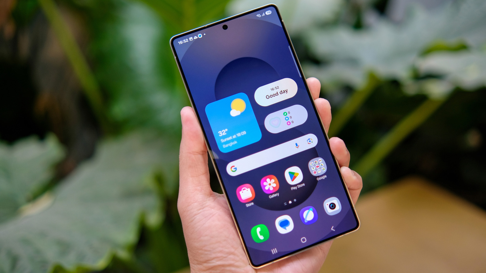
In the relentless march towards streamlined user interfaces, every pixel and interaction is scrutinized. So when Samsung, a titan in the Android ecosystem, subtly retired the dedicated "all apps" button from its One UI home screen by default, it marked a quiet but telling moment in mobile UX evolution. Yet, true to form, the Korean giant didn't fully commit to a scorched-earth policy, instead offering a discreet toggle for those who cling to muscle memory over modern gestures. This isn't just about a button; it's a microcosm of the ongoing tension between design progress and user habit in consumer tech.
The Gesture Era Takes Hold
For years, the Android app drawer was a digital sanctuary, a place to stash icons away from the coveted home screen. While Apple traditionally plastered every app onto its primary canvas, Android offered a cleaner aesthetic, accessible via a dedicated button. But as smartphone UIs matured, and as larger screens demanded more fluid navigation, the industry broadly gravitated towards gesture-based interactions. A simple swipe up from the home screen became the ubiquitous method to reveal the app drawer, rendering the standalone button a digital anachronism. Most manufacturers embraced this wholeheartedly, simplifying their interfaces and freeing up precious dock space. Samsung, with its One UI, largely followed suit, pushing the swipe as the primary interaction.Samsung's Calculated Compromise
What sets Samsung apart, however, is its enduring pragmatism. Unlike some rivals keen on dictating a singular "best" user experience, Samsung has often prioritized user choice and customization. The decision to retain the "show apps screen button" as an option, buried within settings, is a prime example. This isn't mere oversight; it's a calculated compromise. It acknowledges that a significant segment of its vast global user base still prefers or requires the visual cue of a button. Perhaps they're long-time Android users resistant to change, or new smartphone adopters who find gestures less intuitive, or even those with accessibility needs. By keeping the option alive, Samsung avoids alienating loyalists, reinforcing its reputation for versatility and user-centricity, even as it nudges the broader user base towards contemporary UI paradigms. It’s a delicate balancing act – pushing innovation while respecting ingrained habits.The Global Angle
For "The Byte Republic" audience, this seemingly minor UI tweak carries significant global implications. Samsung’s market dominance means that any design choice, however small, impacts hundreds of millions worldwide. In diverse global markets, where digital literacy levels and technological adaptation rates vary wildly, maintaining options for familiar interactions can be critical for user adoption and satisfaction. A user in a developing market, perhaps getting their first smartphone, might find the tangible "button" easier to grasp than an abstract "swipe." This decision also speaks to the broader industry debate: how much control should Big Tech exert over user experience versus empowering individual choice? Samsung's approach suggests a leaning towards the latter, a philosophy that often resonates strongly with a global audience demanding adaptability from their devices. It underscores that in a globalized tech landscape, catering to diverse user preferences is not just a feature, but a strategic imperative.Source: Engadget

Silicon vs. Slop: The Battle for Photographic Authenticity Begins
As AI deepfakes flood the internet, CAIM1's prototype camera offers a hardware-backed cryptographic solution to restore trust in digital images. "The Byte…

Decentralized AI: The True Cost of Cutting the Cloud Cord
Want AI on your own terms? The Byte Republic explores the critical hardware specs and financial investment needed to run powerful LLMs directly on your PC.

Your Old Laptop's Encore: Unleashing Dual-Screen Productivity Without New Hardware
Unleash hidden potential! Learn how savvy tech users are transforming old laptops into valuable second monitors, boosting productivity and reducing e-waste…
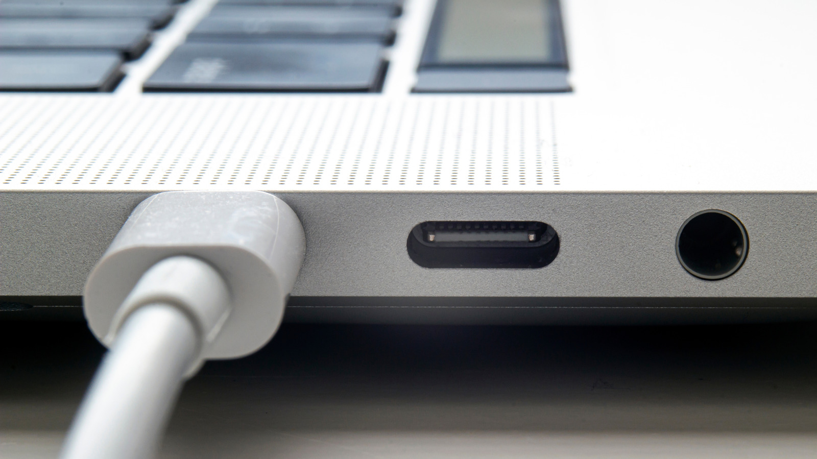
The Phantom Port: Decoding Your MacBook's USB Disconnects
Even Apple, a USB pioneer, can stumble. Dive into why MacBooks sometimes miss USB devices, common fixes, and the global implications of connection friction.

AI's Architect Under Siege: Jensen Huang's Affair Sparks Espionage Probe
NVIDIA launches probe into CEO Jensen Huang over alleged Chinese spy efforts, linking a top executive's affair to national security concerns in the AI race.

Defying the Upgrade Cycle: Your Old Smartwatch Isn't Dead Yet
Don't toss that old smartwatch. Discover how to transform forgotten tech into a dedicated AI assistant, tracker, or note-taker, challenging Big Tech's upgrade…
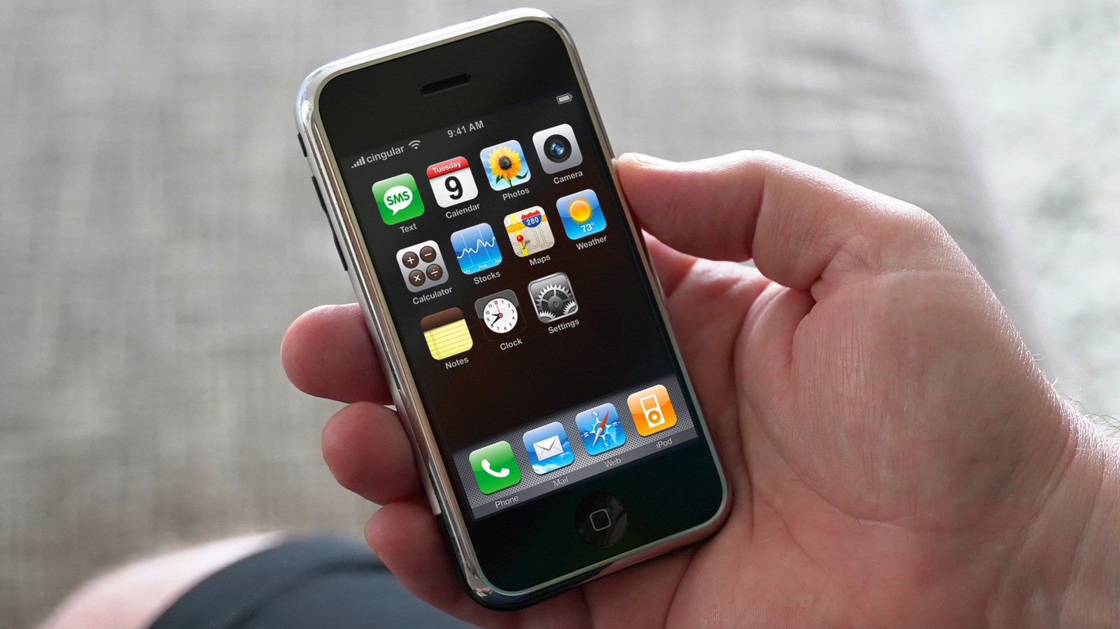
The iPhone's Enduring Illusion: What the 'Cheaper' Past Really Cost
Unpacking Apple's iPhone pricing from 2007 to today. The Byte Republic examines how inflation and carrier shifts redefine perceived value for global consumers.